An organization now capable of leading its entire industry toward a sustainable future.
Services
/strategy
/purpose
/brand identity
/logo design
/brand activation
/brand video
/brand activation
/web design
/brand activation
/purpose activation
the quest
IPPAG is a large international cooperative of producers and suppliers of merchandising products. It operates in a sector with many critics, as it is considered highly polluting and non-essential. They contacted us because the detachment from the brand was causing issues like lack of differentiation from organizations with similar objectives, loss of members to other organizations members demanding something tangible in return for their participation, limited reach in multiple countries… They genuinely wanted to implement significant changes, even if they weren't exactly sure what those were, and reflect them in an updated and powerful rebranding.

The organization that seeks to lead its entire industry toward a sustainable future.
the revealed
truth
/strategy
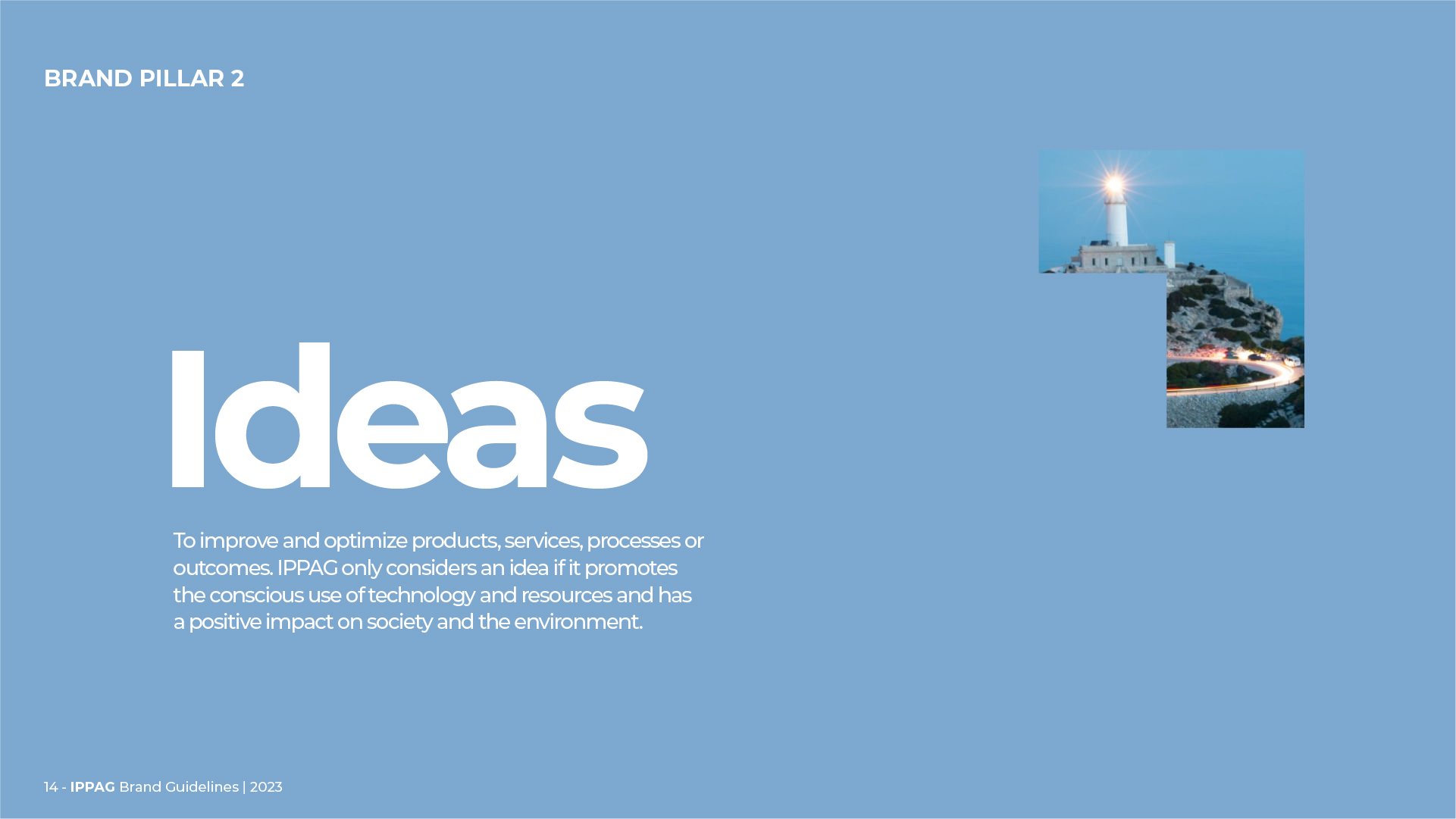
Trends showed that the risk of appearing as just another greenwashing agent in the market was very high. IPPAG understood that it had to responsibly acknowledge that its role in the world had changed, and that its purpose was no longer simply to build a commercial network or to be a disseminator of knowledge, as it had been until that moment, but rather to become a source of real transformation for its industry. And this should be done by understanding sustainability in its broadest sense: creating implementable practices that change the relationship between businesses and the market, the earth, and, why not, our bodies.
/purpose
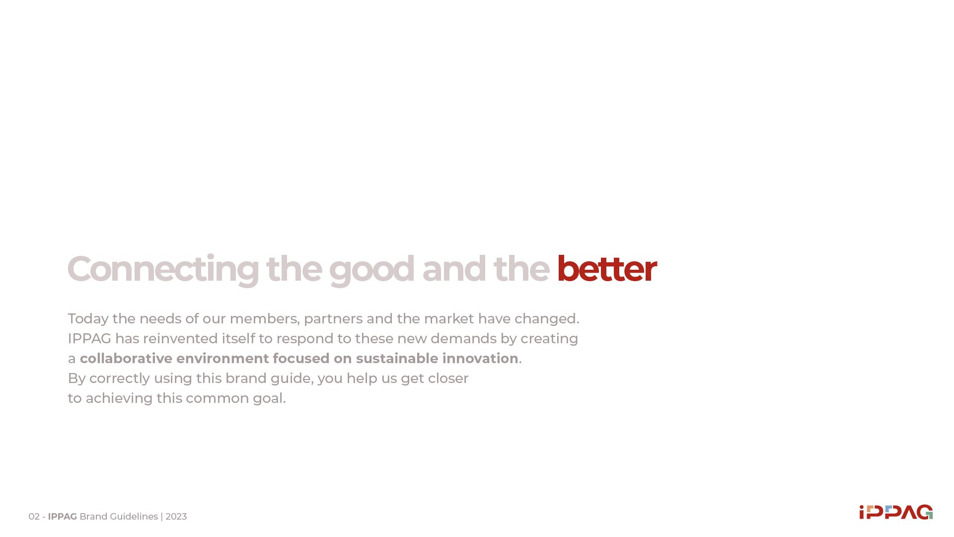
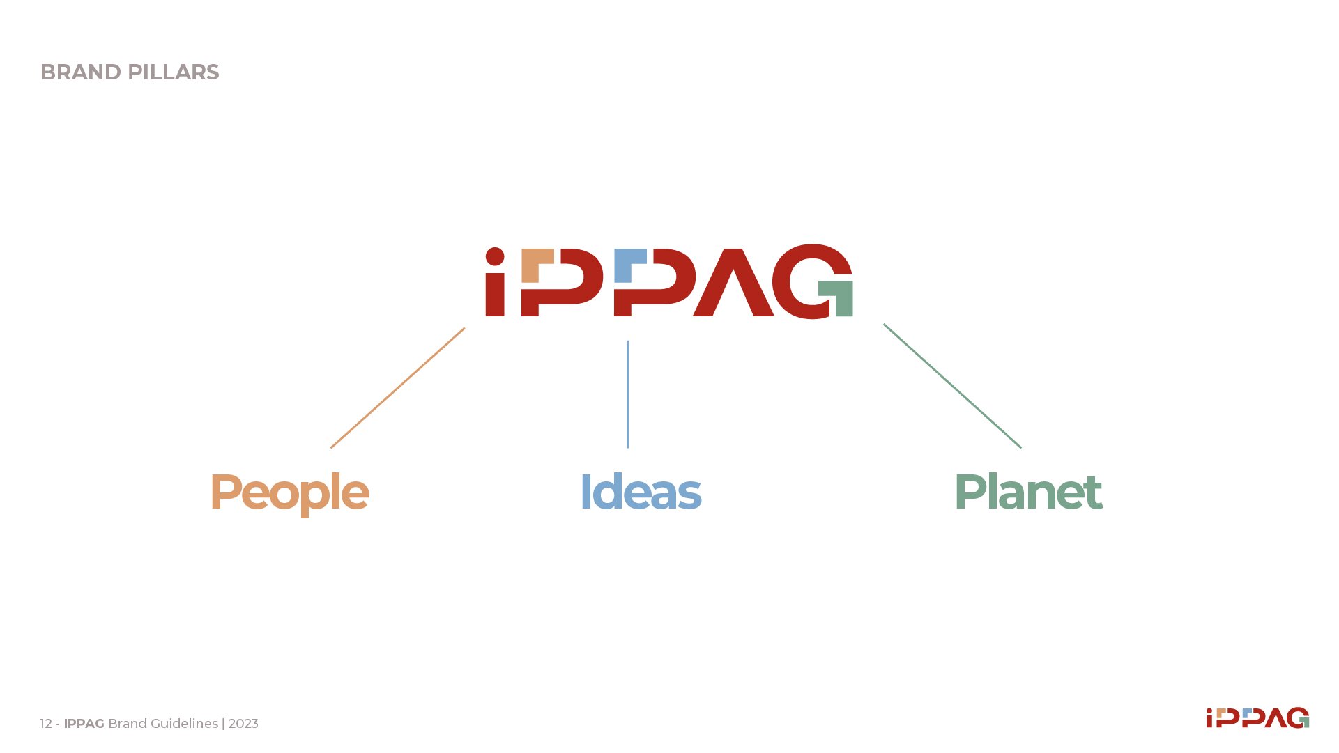
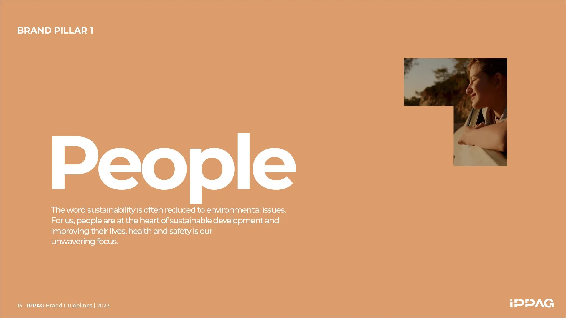
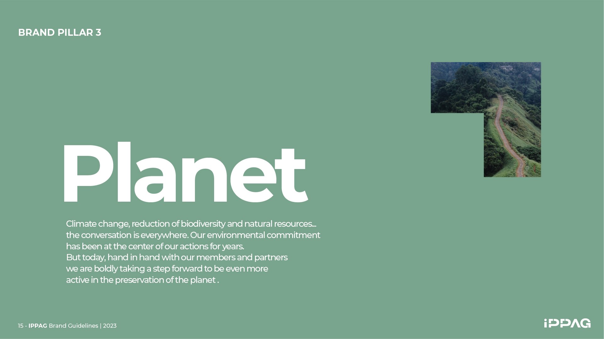
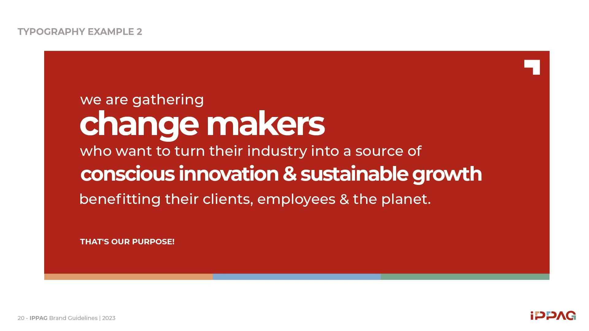
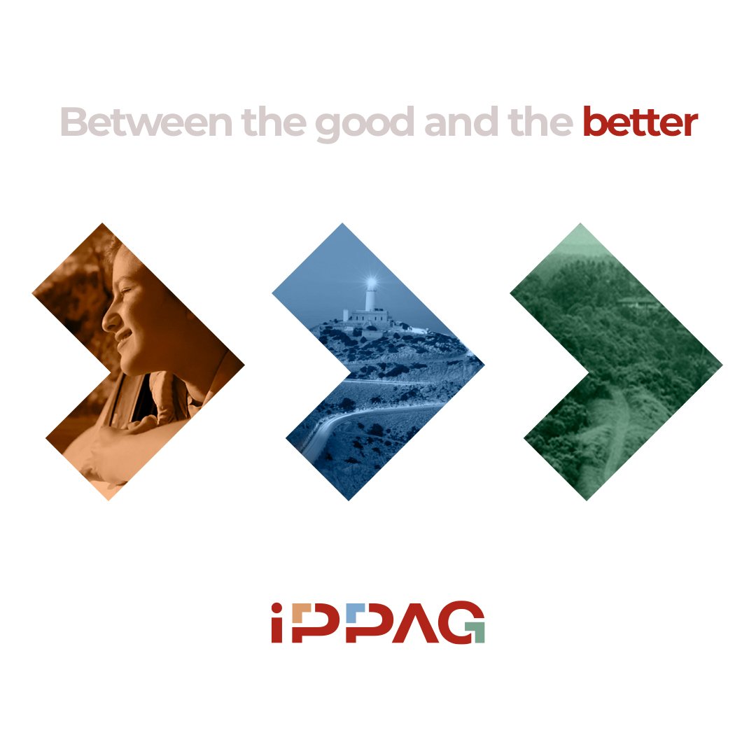
IPPAG’s purpose was written in response to this change in its role: the institution would serve as a continuous call to gather change-makers who seek to transform their industry into a source of conscious innovation and sustainable growth. While awareness levels differ among member companies, the broader market trend toward more sustainable products made it possible to focus this purpose on both creating real impact and ensuring the sector’s viability in the medium term. IPPAG would assist them in a process of continuous improvement, finding themselves somewhere between what is good and what can be even better.

the Brave Brand
Florence Monsnier, General Manager of IPPAG, knows the branded merchandise industry is at a turning point that cannot be ignored, and the people within her cooperative are asking the organization to react. She understands the need to build differentiation and firmly believes in working with purpose: as long as the future lies ahead, she chooses to shape it.

Brand Identity
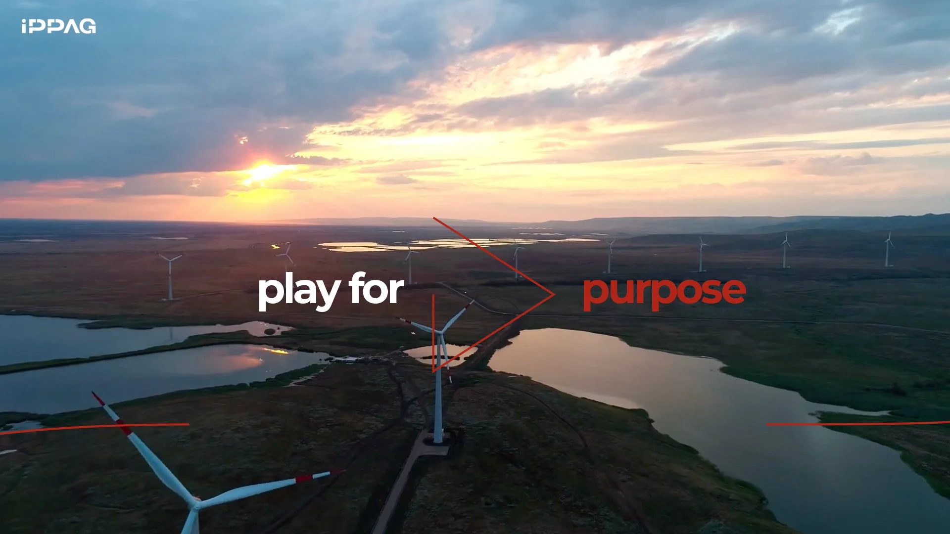
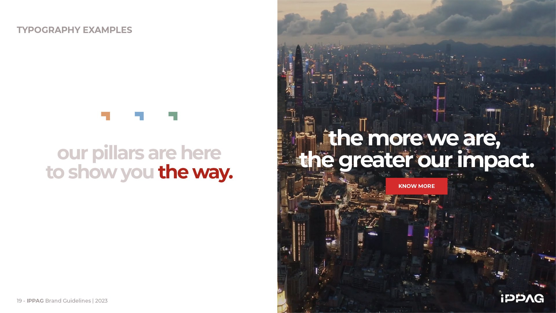
The new brand identity had to reflect this change in role, taking into account the complexity of the environment in which IPPAG operates: a multitude of countries, languages, sensitivities, and market conditions... and the result had to be equally valid and engaging for everyone around the shared purpose. For this reason, IPPAG’s call had to be, in a sense, passive; the final decision, the feeling of being summoned as a change-maker, had to come from each member or prospect. IPPAG shows the path to transformation, but the decision to follow it or not depends on each of us. That’s why we sent an open invitation: THE MORE WE ARE, THE GREATER OUR IMPACT.


Behind the logo
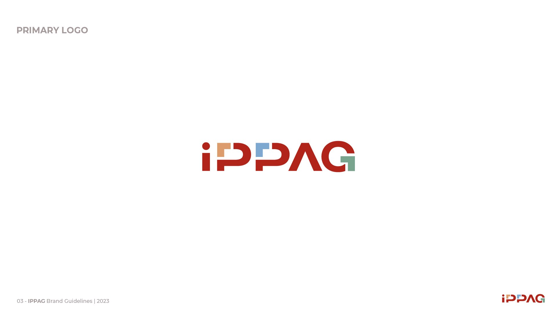
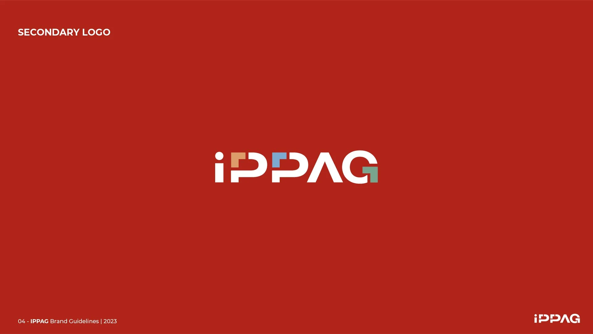
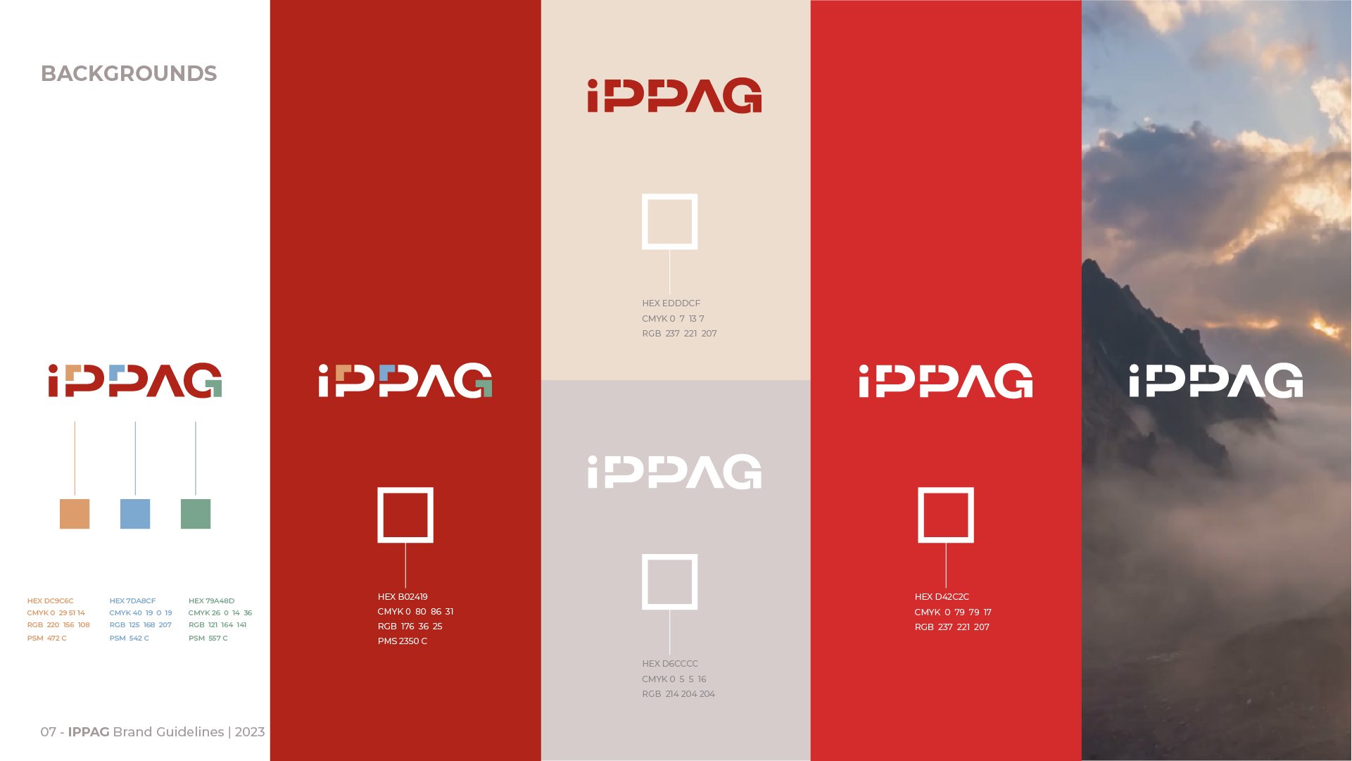
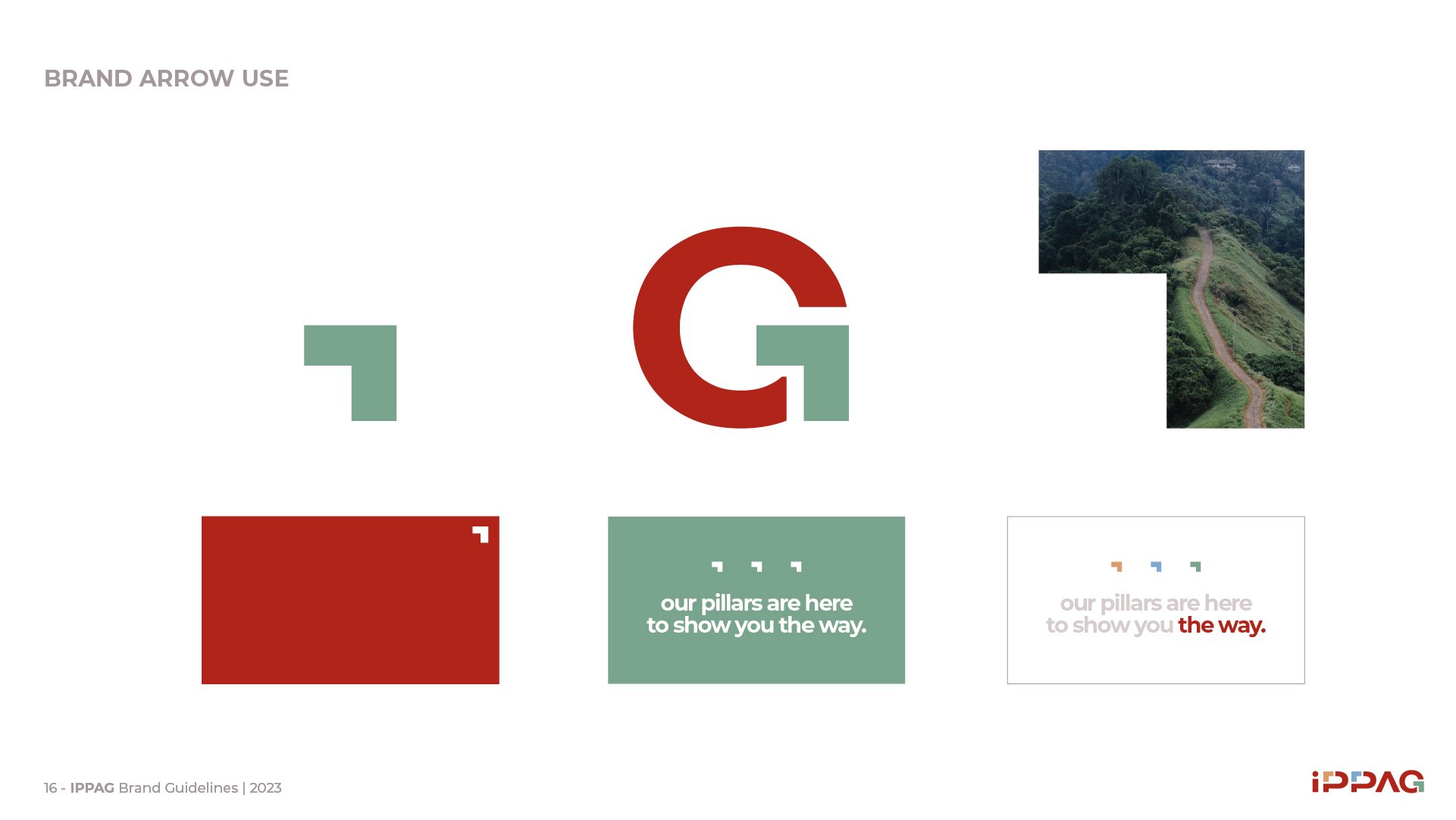
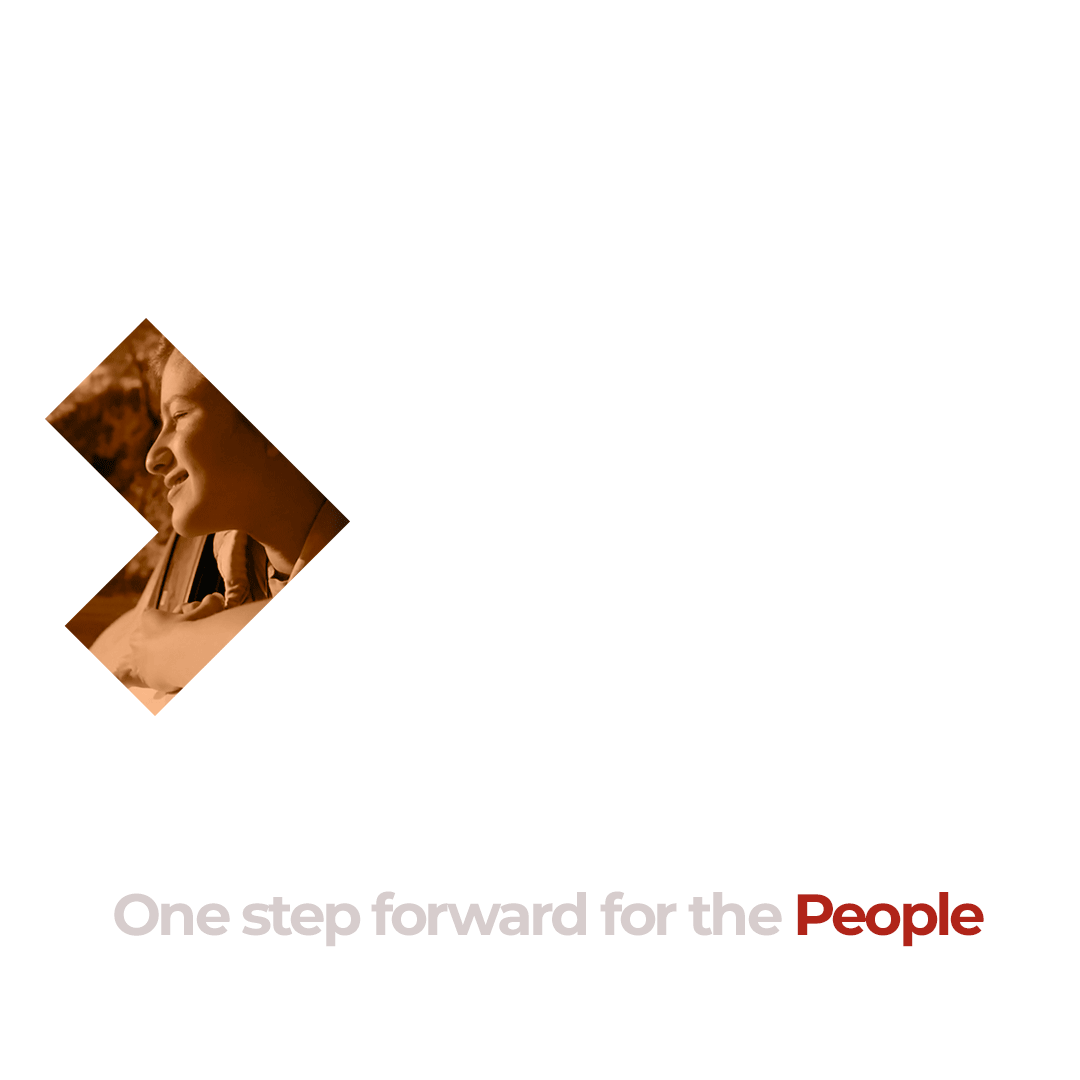
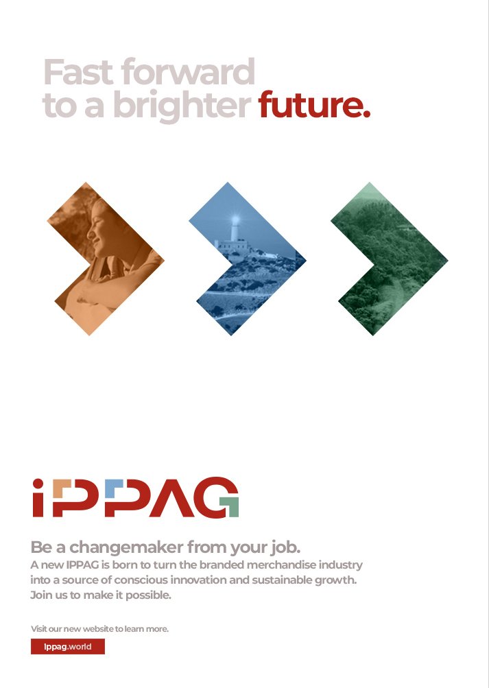
IPPAG is a well-known and respected institution, yet its new graphic identity needed to clearly reflect the brand’s new pillars. After 50 years with the same corporate red, we introduced new colors to signal transformation with a vibrant, energetic code. Additionally, a playful touch was essential. After all, Branded Merchandise is an industry tied to moments of leisure and fun. As a cooperative, IPPAG’s logo had to convey a collective spirit—a brand shaped by the synergy of diverse elements.This also emphasizes the diversity and versatility of its members and products. New elements, like colored arrows, add flexibility and depth, enriching the brand’s visual and conceptual language.


Brand activation
Launch campaign
DimThe launch campaign summarized all the strategic brand and visual identity changes in a clear, straightforward way across a few pieces. These highlighted the cooperative as the guide for a steady process of improvement—step by step, yet accelerated by the presence and collaboration of everyone involved. *The more we are, the greater our impact.*
The Purpose Activation is opening unexpected doors for IPPAG, making it the leader they aspired to be.
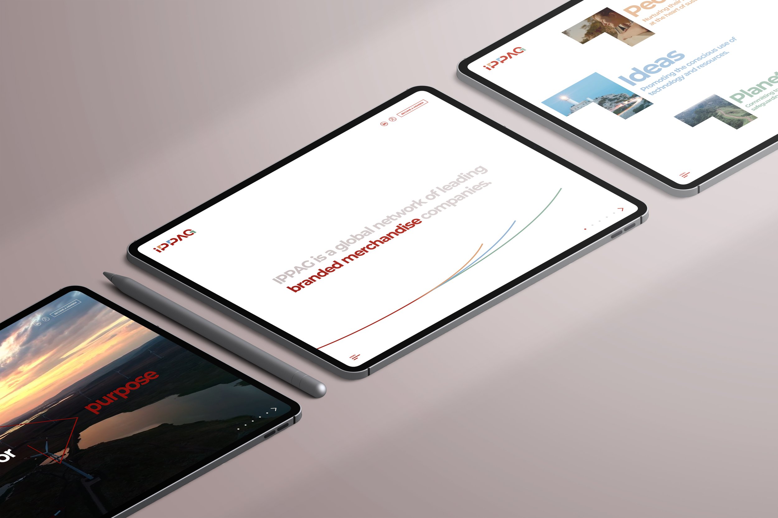
Web design
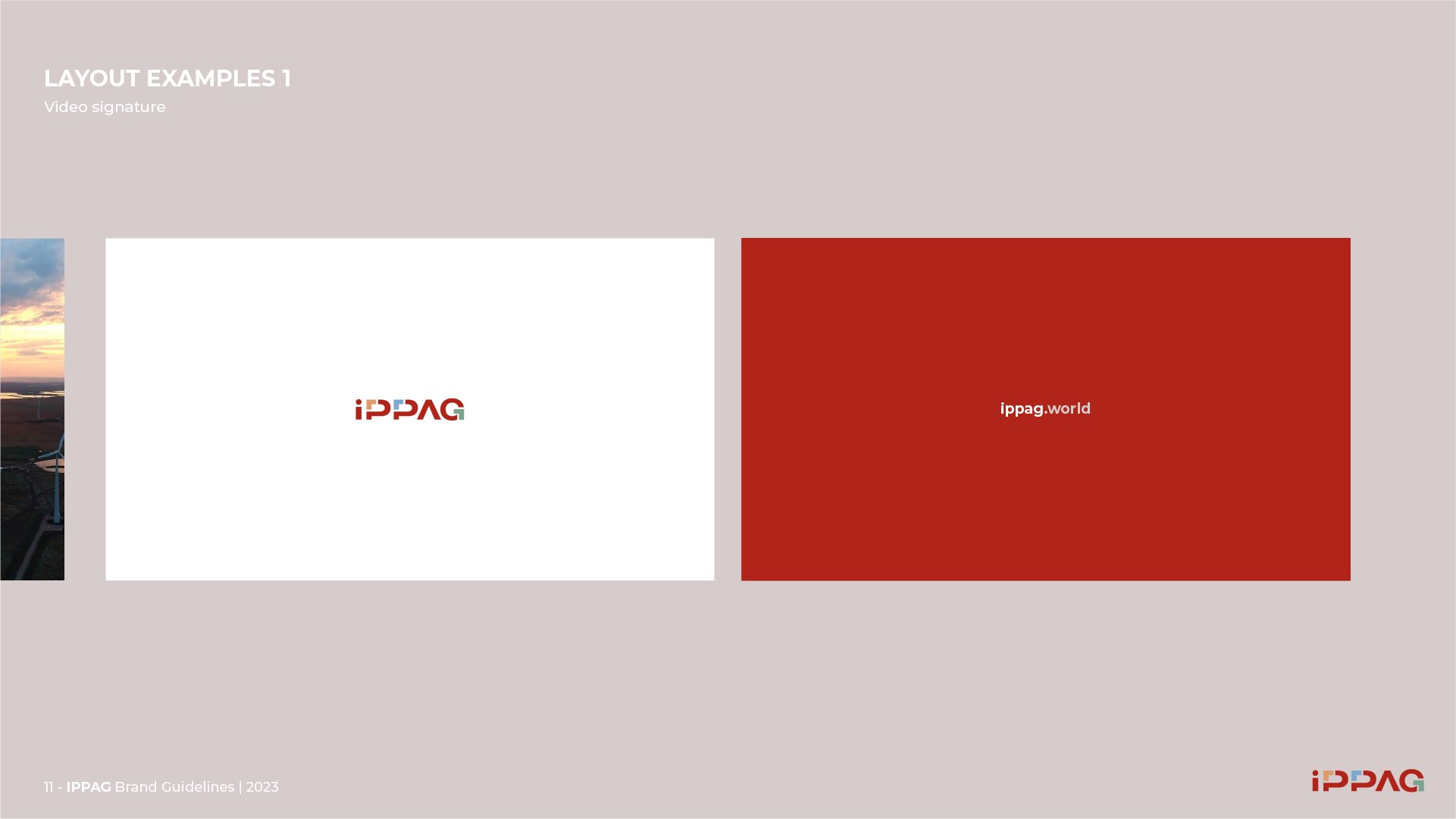
Dimension, purpose, engagement, audiovisual richness and UX... even a new URL, ippag.world, for the cooperative’s new website. A permanent platform for IPPAG’s invitation, a meeting point for the change-makers who want to leave a legacy for People and the Planet through their Ideas..


Florence Mosnier | General Manager
“ Pending clients' review. ”
The results
✦
The perception of IPPAG is attracting so much interest that it is already helping in the recruitment of new members.
✦
IPPAG is about to definitively move from words to action through the full activation of its purpose.
✦
Counselor Magazine chose Florence Monsnier, main impulsor of the IPPAG transformation, person of the year 2024.