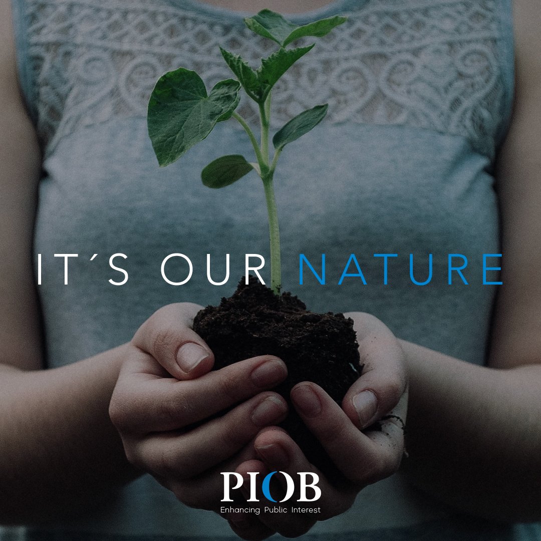
Making Public Interest a tangible reality for all.
Services
/Strategy
/Purpose
/Brand identity
/Brand design
/Web design
/Purpose activation
the quest
The Public Interest Oversight Board (PIOB) is an independent global body that oversees the international standard-setting process for audit, assurance, ethics, and independence standards. Its mission is to serve the public interest and build trust in global markets.
While the PIOB felt that its logo and graphic identity had become outdated, our research revealed deeper challenges:
Unclear definition of its role
Lack of visibility and awareness
Weak institutional identity and presence
Difficulty engaging with the broader public
Challenges in attracting talent
Undefined communication strategy
Over-reliance on traditional communication channels

the revealed
truth
/strategy
Every process starts by defining objectives. Sometimes clients have clear goals; other times, they are only suggested. Rarely, however, is the potential impact of rebranding fully measured from the beginning.
As we delved deeper into understanding PIOB's work, it became clear that this task would take on an unexpected dimension and have far-reaching consequences as we connected its relationship ecosystem with the organization's purpose.
/purpose
The brand purpose was embedded in the organization's name: Public Interest Oversight Board. Yet, their highly technical work was being carried out without directly engaging the public—the true beneficiaries of international standards.
This made it critical to revisit and discuss the concept of Public Interest:
What does it truly mean?
What role does the PIOB play in it?
Could more human, clearer communication be the key?
It became essential to emphasize the PIOB’s role through a new tagline and messaging framework that empowered members as agents of change—bridging the gap between expertise and public understanding.

the Brave Brand
Rocío Goudie, the PIOB’s Director of Communications, strongly supported the bold vision we presented. She played a key role in advancing it internally, despite the challenges of shifting the focus from purely technical outputs to a more purpose-driven and outward-facing narrative.

Brand identity
The challenges identified at the beginning of the process needed to be addressed from a common brand identity foundation, but with individualized approaches. This led to the development of a brand architecture that was diverse yet cohesive, all centered around the Public Interest and the core PIOB brand. These secondary brands, which had not previously been given the attention they deserved, had the potential to positively impact the various engagement issues the PIOB was facing.
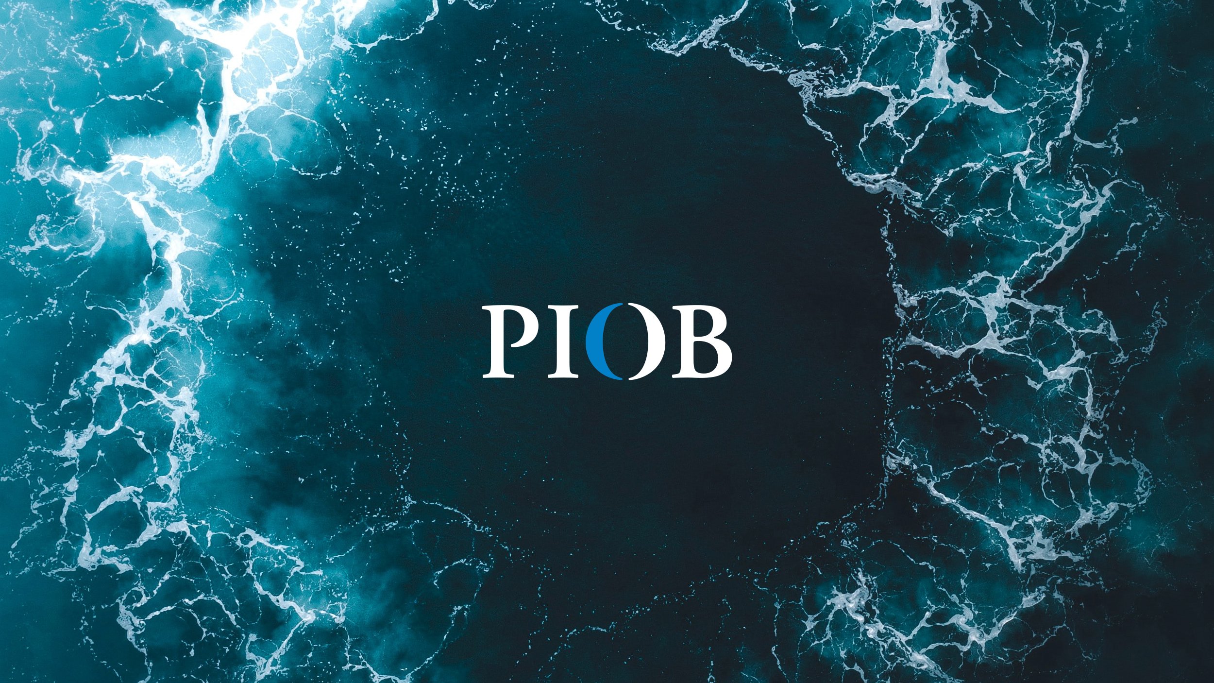
Behind the logo
Crafting the new PIOB logo from its previous brand image involved a radical "evolutionary" exercise. Key meanings were preserved and even amplified through the maximum simplification of its elements. The former icon of the Planet Earth was distilled into the "O," emphasizing the Oversight role the organization plays on a global scale, both eastward and westward. The result was a contemporary identity that stands out distinctly within the finance and audit sector—a versatile and human approach that opens new paths for the organization without losing the seriousness required for the critical work they do.

It also opened doors for internal teams and their specific goals, who felt supported, valued and heard, through the creation of a brand ecosystem that makes their work more appealing (essential for talent acquisition, for instance) and exponentially increased the perceived value of their work and of themselves as professionals, compared to the original materials.


Brand activation
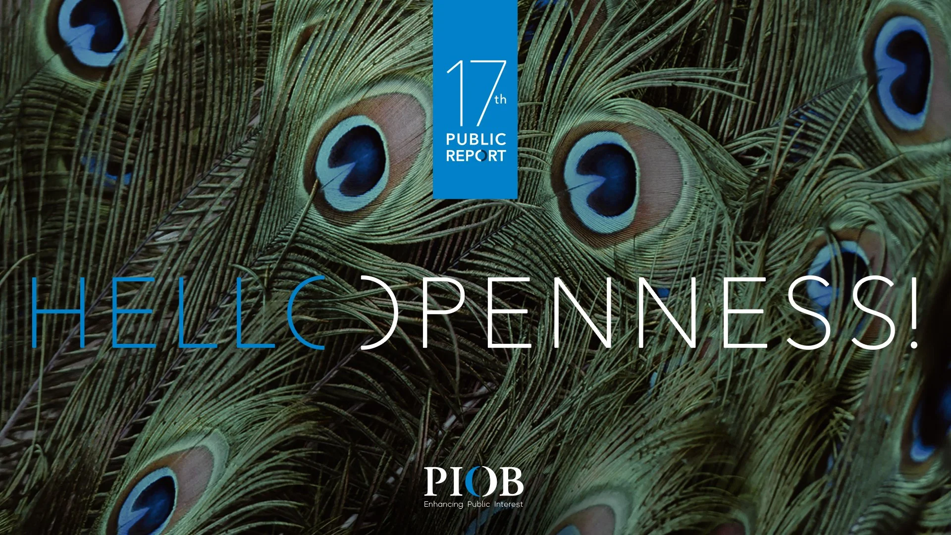
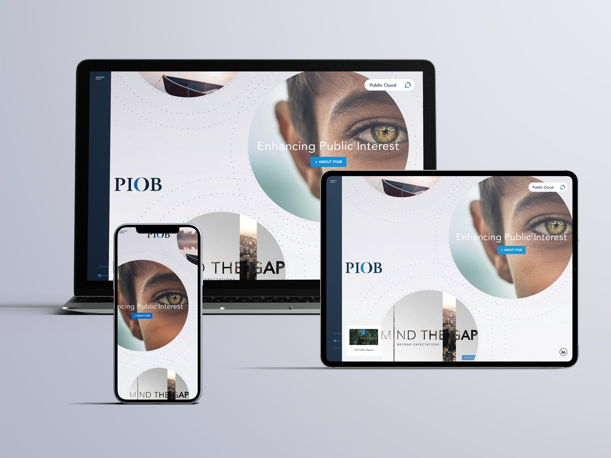
Web design
The arduous task of producing highly sophisticated documents by the PIOB has a key focus: their availability and easy access for anyone interested in consulting them. Therefore, we’re talking about the organization's essential need for a document repository with seamless usability. That’s why we focused on a usability that simplified the search, making it more rewarding for the client’s team, as it now had to align, for the first time, with the brand's purpose.
Total transparency and an optimal UX, yes, but without losing sight of the reasons these documents were developed and the people who made them possible. Always keeping the Public Interest in mind.


Purpose activation
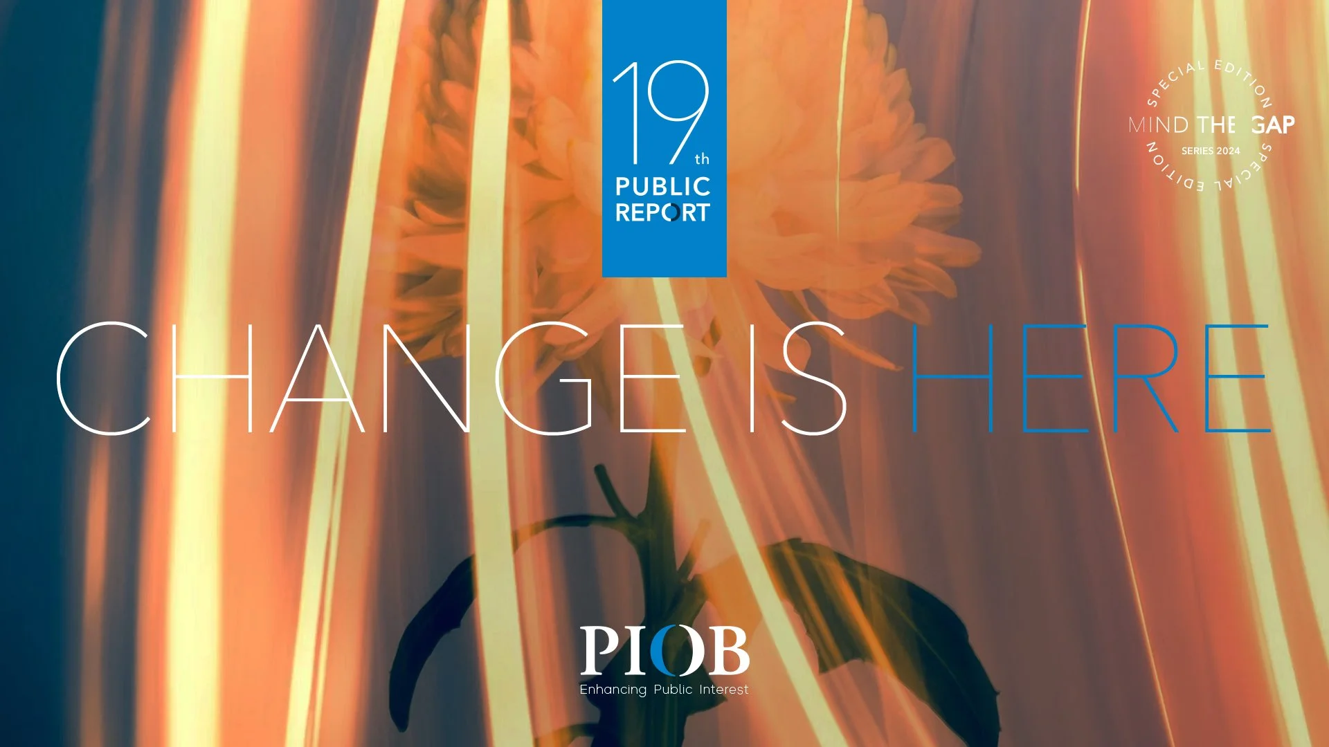
From the organization’s need for renewed energy, an idea emerged—one with the potential to move PIOB significantly closer to the purpose it serves. We proposed they become the center of meaningful conversations on the critical issues PIOB addresses, bridging the gap between current realities and their aspirations. This initiative, *MIND THE GAP*, is a digital series with each chapter exploring a different "GAP," such as sustainability, legislation, and opportunity.
To learn more about how PIOB is bringing its purpose to life, click here for the *MIND THE GAP* case study.

Rocio | Communication Director
“ Developing a communications strategy for a highly technical organization, whose work is largely intangible and realised through the outcomes of other bodies, was uniquely challenging. It required going beyond logos and taglines, and translating complex, behind-the-scenes work into a clear narrative that resonates with people. The goal was to show how trust, integrity, and public interest are not just values we uphold, but tangible outcomes of our daily efforts. ”
The results
✦
PIOB has shifted from near invisibility to a key player, gaining recognition from shareholders and major institutions in the sector.
✦
Increased perception of PIOB’s leadership has led to more website visits and document downloads.
✦
The Public Interest is strengthened daily by a team motivated to make its purpose a reality, inspired by their new visibility.
✦
PIOB's LinkedIn followers have grown tenfold since the new brand launch.
✦
The SSB Nominations campaign is now an annual milestone, attracting high-profile CVs at an unprecedented rate.